Docs
The next gen of UI components
Simple. Powerful. Beautiful. Build Notion-style applications efficiently with our flexible React building blocks.

Pre-built components for rich text and docs
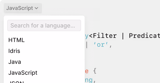
Code Block
Drop-in syntax highlighting for dozens of languages.
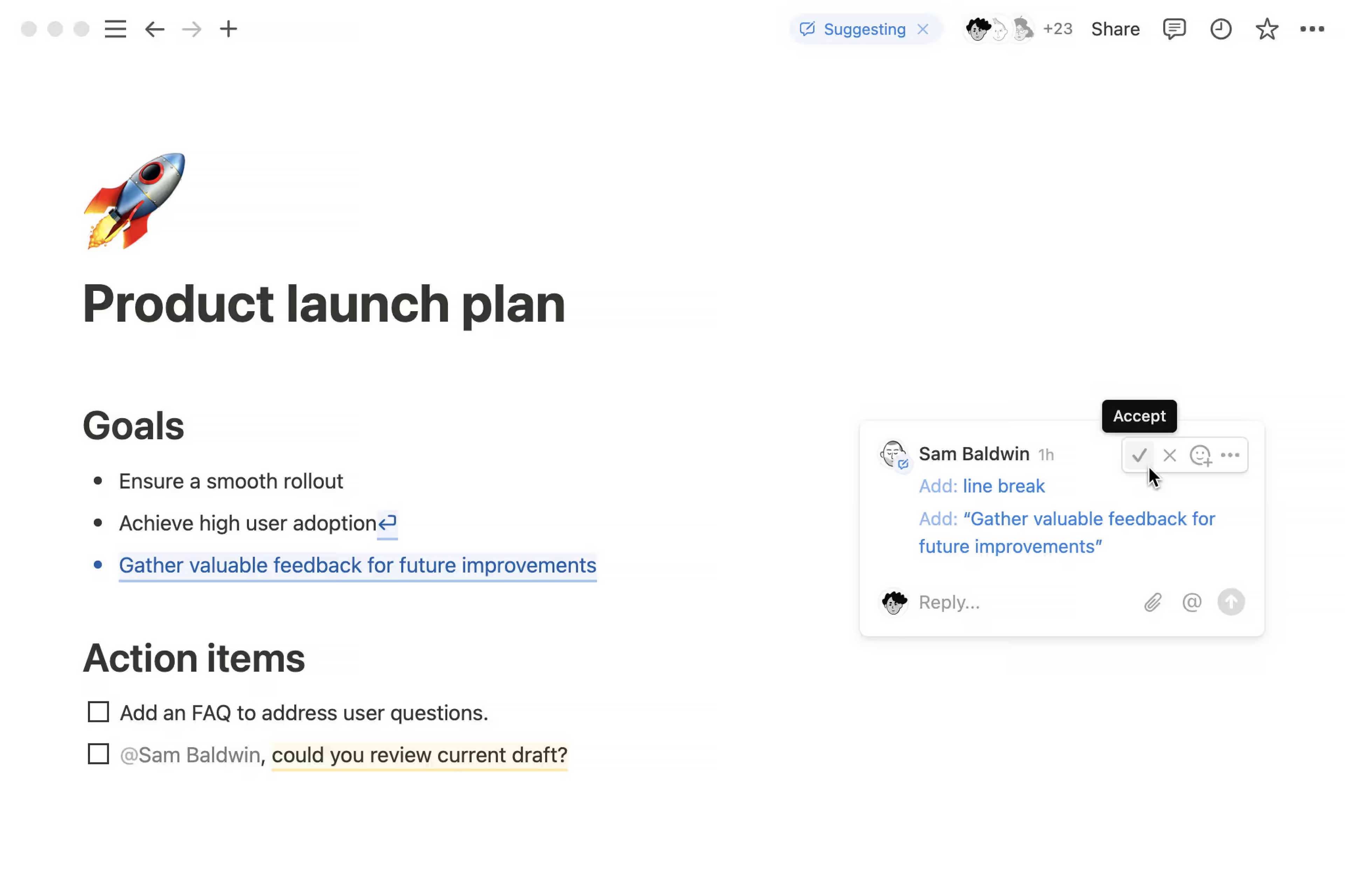
Toggles
Accessible collapsible sections to keep layouts clean.

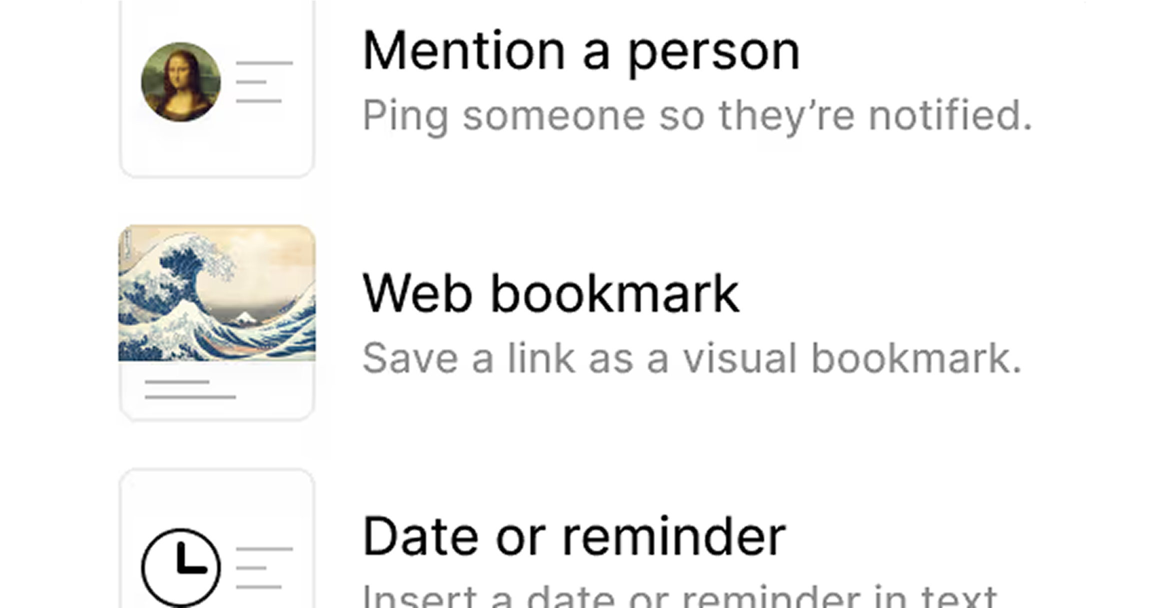
Media Embeds
Ready-to-use components for images, Loom, and YouTube.

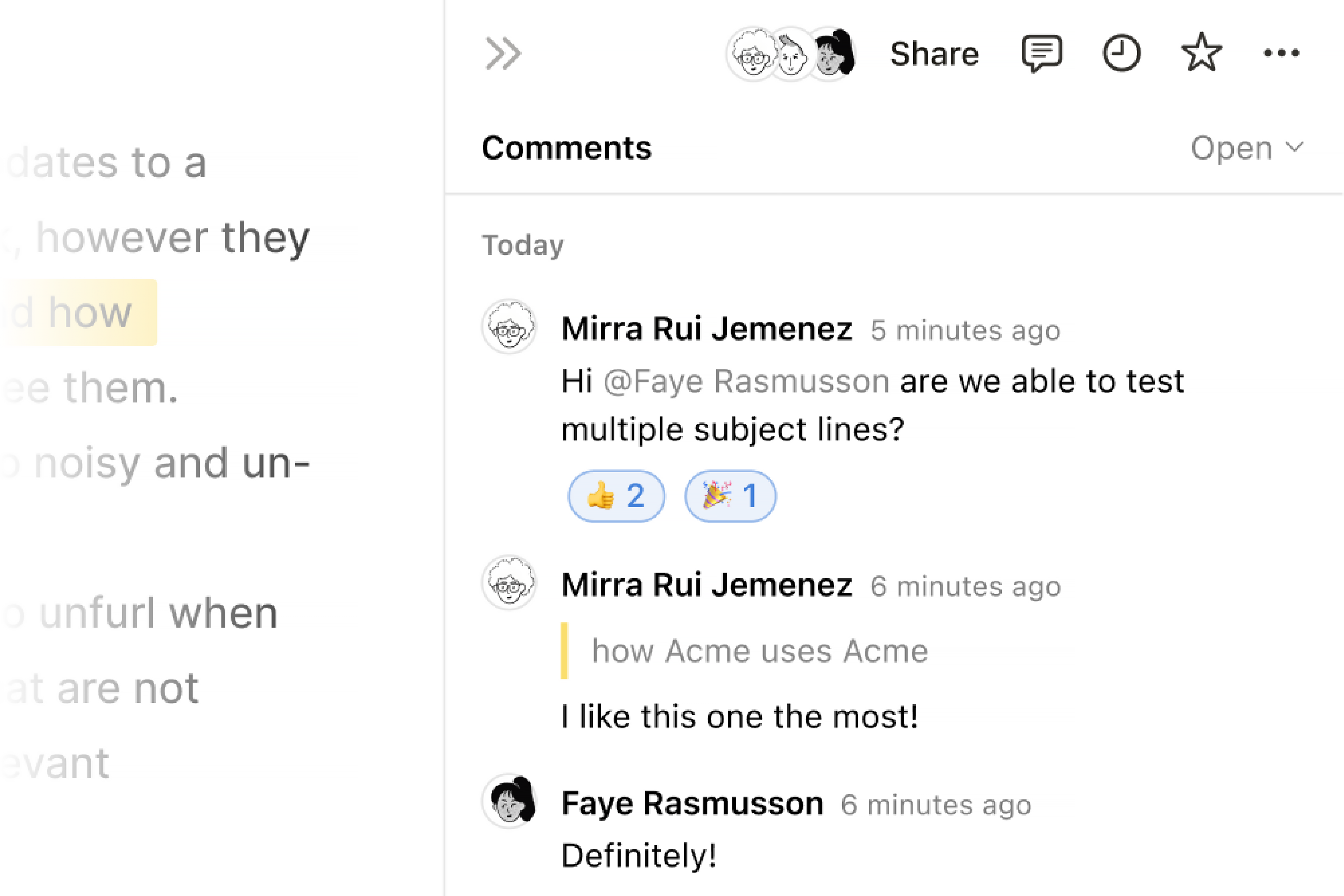
Table of Contents
Auto-updating navigation primitive for long-form content.

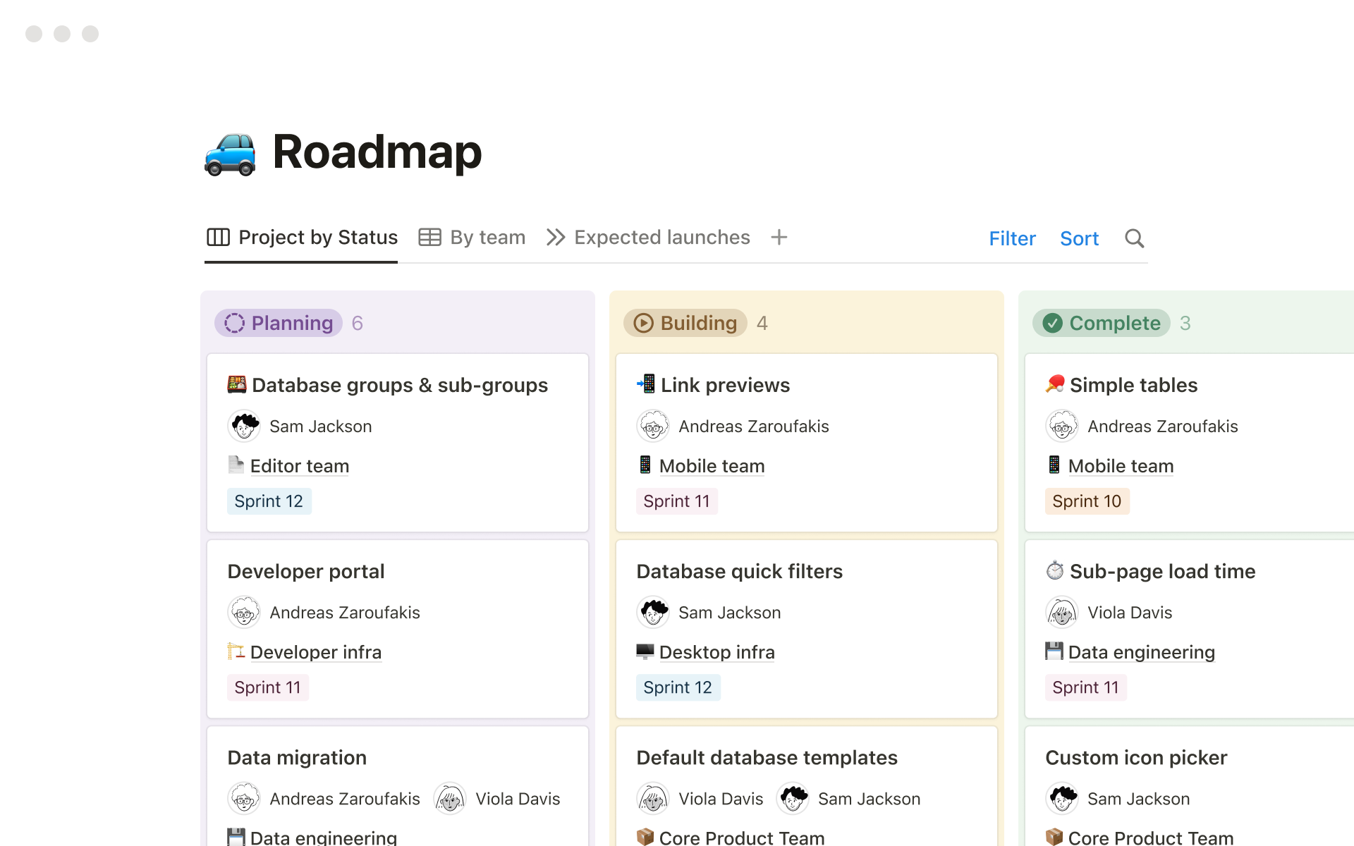
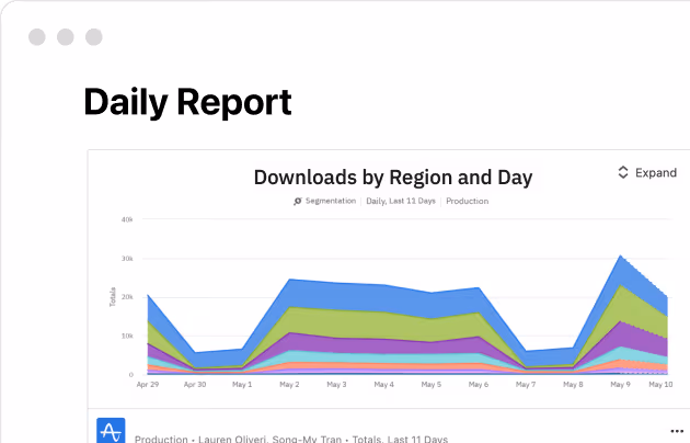
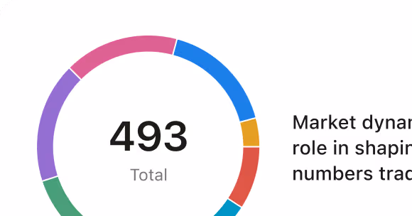
Charts
Beautiful data visualization components.
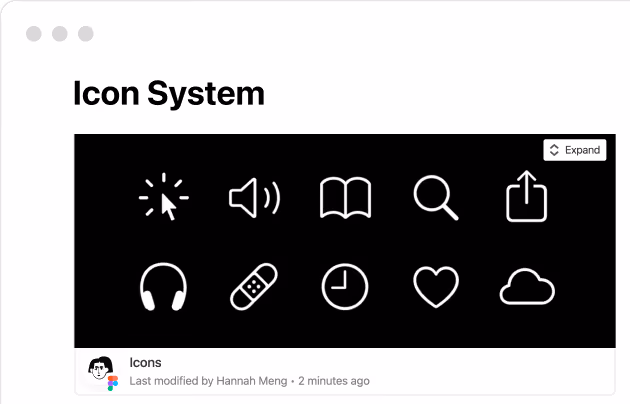
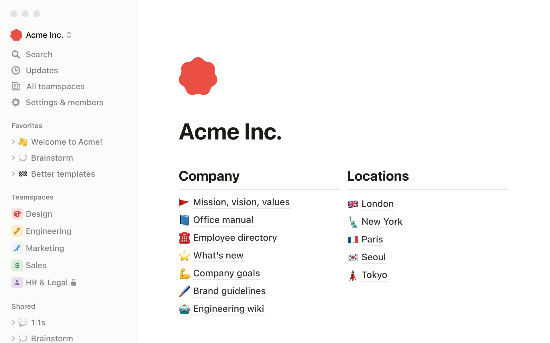
And 50+ more primitives
A comprehensive set of building blocks for your app.
Bring your own design system or extend with Tailwind
Notion-styled & Flexible by default
Notion Kit components are designed to adapt to your brand, whether you use Tailwind CSS or your own custom styling solution.
"Notion Kit saved us weeks of UI development time. We just dropped the components into our React app and styled them to match our brand in minutes."
Built for modern React development
Composable Primitives
Components are built to be minimal and composable. Use them individually or combine them to build complex interfaces.
Strictly Type-Safe
Written in TypeScript with first-class support for strict types, giving you autocomplete and confidence across your codebase.
Built for whatever you're creating
SaaS Applications
Embed beautiful, Notion-like note-taking and document editing experiences directly into your product.
View ShowcaseInternal Tools
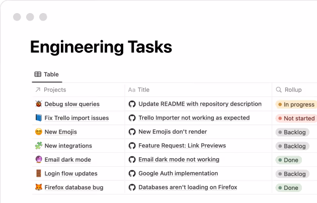
Quickly scaffold rich text editors and complex data tables for your internal admin dashboards.
View ShowcaseDocumentation Sites
Create engaging, interactive, and highly readable technical documentation.
View ShowcaseEverything you need, right out of the box
Open Source
Notion Kit is completely open source and free to use in your personal and commercial projects.
Fully Tested
Backed by comprehensive unit and visual testing, giving you confidence that your UI won't break across updates.